

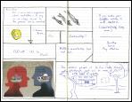


Spent maybe six hours Friday, Saturday, and Sunday working on this. It's the fourth in a series of drawings, roughly seven and a half by ten inches, that are explorations of the the effects of strong blacks and strong whites. No shadows or cross-hatching. I usually draw directly on paper. I use a Canson Comic and Manga drawing pad; it's got a buttery-smooth surface that is easier on the pens that regular watercolor paper. It's also easy to erase, which came in handy this time, because for the first time I actually began by doing a pencil drawing first, at least of the baroque-looking octopus-like figure that starts in the middle right and flows out and down the left. I also decided for the first time to leave a large white panel in the middle instead of filling in every inch with line and color.
The pens in this case are various sizes of Pigma Microns (03, 05, and 08). The 03 gives a nice fine line, the 05 can get in the corners and small shapes, and the 08 is good for laying down a lot of ink at a time when you're filling in.
One thing I'll say about this kind of work: it's incredibly soothing. I put music on (in this case, a playlist of songs by Kate Rusby) and sit and draw and whistle and hum along while I work. (Here's a typically haunting and idiosyncratic version of an old standard, which I kept banging the replay button on while I was working on this.) There are a lot of things these days that I have trouble concentrating for more that a half hour or so, but I can draw for a couple of hours and not lose focus.
I never know when I start what it's going to wind up looking like or how the parts are going to fit together. I did the octopus (not what it's intended to be, but it's a shorthand way of describing the shape, which is the most complex I've attempted) first, then penciled in the straight lines forming the rectangular areas in the background, and then draw the outlines of the boxes so formed with ink. Then it was mostly a matter of deciding, one at a time, what was going to be in each box. It won't be obvious unless you look at it, but there's a logic to that: in the octopus the forms are black and the surrounding lines are white, but it most of the rest the forms are white and the surrounding areas are black.
One unifying stylistic feature of all the drawings I've been doing is the presence of the red seal in the lower right corner, which are the Chinese characters for my initials: RBS.
1 comment:
Love it, Bruce. If I had a FB button, I would even "like" it!
Post a Comment